This post was originally published on May 12, 2014.
Excel is a great program to use if you don’t require complicated graphs and if you use their default formatting (which you shouldn’t!). However, if you need more advanced formatting, making graphs in Excel can become complicated. It’s not impossible though — there are ways to manipulate Excel to create beautiful, custom charts.
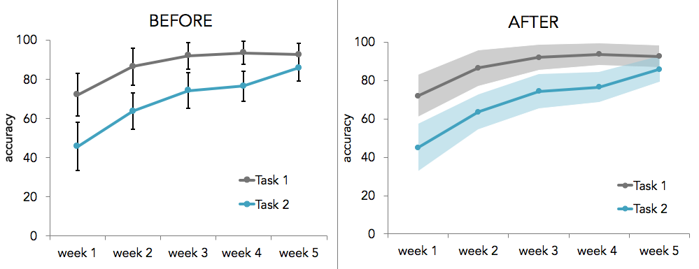
In this tutorial, I describe how to conditionally format graphs in Excel. Conditional formatting is useful when you have two or more conditions that you want to format differently. For example, if you have data from a patient group and a control group and you want to display their data in different colors, sizes, or shapes. Excel does let you format data points individually, but applying the same format to every data point in each condition can quickly become labor intensive. Here's an example where two groups of participants are labeled with different colors:

STEP 1: ORGANIZE YOUR DATA
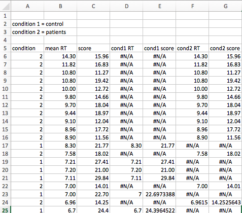
To begin, organize all your data in columns. The first column should contain dummy codes for your different conditions. For example, if you have three conditions, you’ll use the numbers 1,2, and 3 to represent your conditions. The remaining columns should contain your variables that you plan to plot — you should have two columns if you want to make a scatter chart and one column if you are making a bar chart or something similar. In this example, I have two groups: a control group, which I dummy coded with 1, and a patient group, which I dummy coded with 2. Each subject has a response time that is listed in column B:

STEP 2: SEPARATE DATA ACCORDING TO CONDITION TYPE
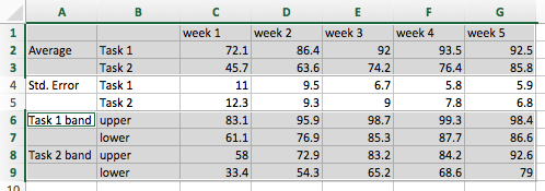
This step includes the meat of the tutorial. First, create new columns for each condition type and each variable (if you have 2 conditions and 1 variable, you’ll need 2 new columns and if you have 3 conditions and 2 variables, you’ll need 6 new columns). In each column, type an IF statement with the following parameters:
=IF(condition = dummy code, variable, NA() )
where "condition" is the cell containing your dummy code, "dummy code" is the actual number of your dummy coding (this number will change in each column), and "variable" is the cell containing your data. So in our example, we’ll use the following IF statements:
In the first new column: =IF(A6=1,B6,NA())
In the second new column: =IF(A6=2,B6,NA())
Finally, apply the formatting to all your data by highlighting the cells containing your IF statements and dragging the blue box in the lower righthand corner all the way down to the end of your data.

STEP 3: CREATE A GRAPH
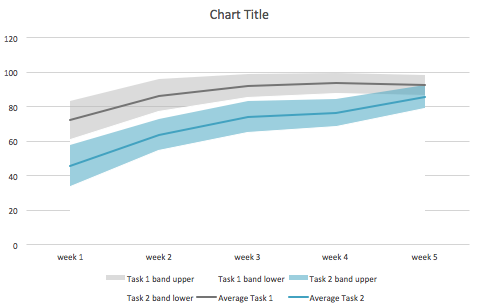
At this point, you can create whatever type of graph you need — this conditional formatting technique can be used to create a wide variety of graphs. In this example, I created a simple bar chart to visualize subjects’ response times according to condition type.
To create a bar chart, click on the charts tab in the Excel ribbon. Highlight the data in the new columns you just created (the columns with the #N/A values), click on the Bar icon, and select clustered bar chart. Now when you click on a datapoint in the graph, it will highlight all of the other datapoints that belong to the same condition. You can format the datapoints in each condition separately.

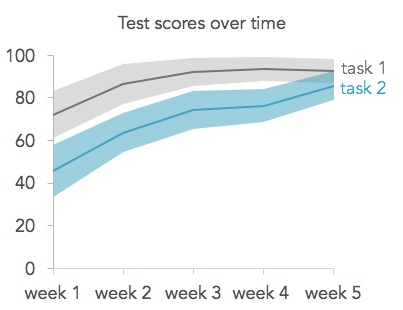
To make the spacing of the bars uniform, right click on the data series and select format data series. Change the overlap to 100% and the gap width to 100%. To finish formatting, I removed the gridlines, added a title and and x axis label, changed the typeface of the axes and labels to Avenir, changed the color of the bars to a neutral gray for the controls and a teal for the patients, and removed all shadows and other special effects. I also removed the y-axis labels since the subject number does not matter in this case. Here’s the finished graph:

You can use the same conditional formatting technique to create scatter plots too. Here's an example of how to set up the data:
And here's what the formatted scatter plot looks like: